SONY Retail Store
1. Moving Ceiling
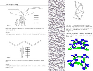
Customers walking through the store will be recognized by the ceiling, which transfers there movements into different shapes. They are simple movements for a single customer, but when the store is crowded with customers, the ceiling will form shapes like a crumbled paper. Especially when to customers cross or step close to each other with different intentions, these intersections in the ceiling will create a interesting shape.

Customers walking through the store will be recognized by the ceiling, which transfers there movements into different shapes. They are simple movements for a single customer, but when the store is crowded with customers, the ceiling will form shapes like a crumbled paper. Especially when to customers cross or step close to each other with different intentions, these intersections in the ceiling will create a interesting shape.
Pattern-Animations
The single peace of the pattern slides apart and increases it size in 2 dimensions.
Putting this single element together and allow it to fold and bend, I got a high flexible peace for creating a pattern that is able to move in all directions and increase seperate parts of it wherever it is requiered.
This animation shows how the pattern can increase/decrease it size.
2. Moving Building
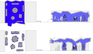
The products in the store are presented on "presentations-islands". These islands are surrounded by a skin which is made out of the pattern.
At daytime this skin creates a space around the islands. The customer is welcome to enter the space and experience the world of SONY. Everything else, that is needed for the shop (Cashier, seats,...) will be folded by the skin.
At nighttime the skin folds up around the islands and creates a roof inbetween the islands. Now the customer is still able to see the products even at nighttime.
The islands can be relocated every morning according to the needs of the customer, the products and events by SONY. The movements of the ceiling during the day are captured by a program which calculates for example average or interesting moments. With these changes over the day, the building will fold up and down differently every day.
Renderings
Animation
This animation shows the change from daytime to nighttime. It is just one possibility how it could fold up. The folding will change every day according to the path-history of the customers and the location of the islands.
Sideplan
The building is located on an intersection of the main street-ring of munich. On one corner is the BMW-Museum,BMW-Tower and BMW-Production located and on the other corner is the OLympic-Park occupied. On the corner of the intersection you can find the double cone, which displays the main design idea, from which the roof evolves to occupy the building.
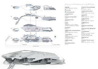
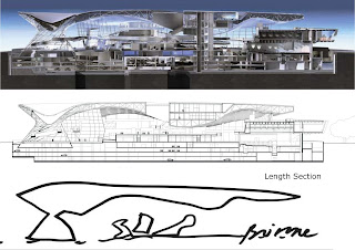
Floorplans and Sections of the BMW-Welt
The main element of COOP HIMMELB(L)AU design proposal is a large, permeable hall with a sculptural roof and the double cone which emerges in relation to the existing headquarters complex.
The hall is a marketplace for differentiated and changing uses and an unmistakable sign for the BMW Group.
The interior topography creates differentiated spatial densities and fluid subspaces.
The heart of the building is the "Premiere" vehicle delivery area. Hanging above this space are the customer lounges which allow views through the event space and toward the BMW headquarters.
Please click on the pictures to read more
The hall is a marketplace for differentiated and changing uses and an unmistakable sign for the BMW Group.
The interior topography creates differentiated spatial densities and fluid subspaces.
The heart of the building is the "Premiere" vehicle delivery area. Hanging above this space are the customer lounges which allow views through the event space and toward the BMW headquarters.


Please click on the pictures to read more
Pattern
3D-Pattern-Process
3D-Pattern-Process
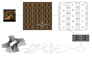
My 3D-Pattern was developed out of a picture of a clockwork. After creating an 2D-Pattern out of the picture, simplifying it and taking a small part out of it, I was able to create the first graphic that had a 3D quality (grey box). In the middle part of the graphic is an interesting part which remebered me of a folding sheet. So I took this part out and modified it to get an interesting 3D-Object.
Subscribe to:
Comments (Atom)


